Thursday 30 April 2015

Materials


I want to plan the samples for next week to keep myself very busy. However, for this blog post I really want to look at the materials I have used in the past and what I want to consider for the next lot of work. Something to add to this is that I have two viscose yarns to make up my warp. Neither are as shiny as I wanted but they are soft and its interesting to see the differences in the twist of the yarn too.


Materials:


PVC - 71% PVC & 23% Polyester & 6% Polyurethane
 I got a lengthen of white PVC tape yarn  of 0.8 Nm. I got this locally and was surprised by their selection of technical yarns available, and the amount of colours too. 


Lurex - This is also an item I got from Uppingham Yarns, the local shop I mentioned before. In fact got two cones; one is vinyl look and the other is opaque. Both are quite fine and fairly delicate - winding a bobbin for the boat shuttle can be a lengthy process


 Chenille - I haven't used chenille before this project but I've enjoyed using it a lot, however it ran out during my last warp. I haven't decided whether I should try getting more to work into this project with. Though if I do decide to source some more I will have to be quick doing so. This does not give me more opportunity to try some other materials in my work though.


Replacement -  I've been advised to bring more contrast into my Textel work, as the new Jacquard warp will be Black and White- like the first warp.
* show work from both warps to compare.

This development with more materials should be easier with the work I've been making on the Textel and Jacquard looms which have used darker grey and black yarns. Which will be more compatible compared the the first samples I made using any grey, which were soft tones. This made some interesting work but looks too soft against the Jacquards. So, I've hoping to use a harsher grey in my work, made of wool or a thicker yarn, to press this contrast in my work.
The chenille and mixed yarns have created tones in my other samples, the grey and lurex will make a stronger contrast.


 I also want to seriously consider my samples sizes and shaping. My new warp allows me to weave 60 cm, and its been wound on the mill to be 7 m in length. I could consider creating 1 m long samples as a norm, from now, which would be great to display, but limits how much I could create. Though with the time limit it could to my advantage.


           ____________________________________________________________________


3 WEEKS

Sunday 26 April 2015

Jacquard Warp


New Jacquard Warp, hopefully ready for Tuesday 5th May.

It will be a  black and white warp, like the one I used at the beginning of the year to create my first few Jacquard samples. This means more contrast in my work and the need to use black and white in the warp, meaning it has to be used in my designs.

This could be a good thing for my woven pattern pieces - for other samples this might not be as advantageous. Especially for samples of just weave patterns in sections as the black will need to be incorporated. Though this could produce some really good ideas and designs.
But I'm going to be happy when I can start weaving again.


This will be my last push for samples and designs.

          ____________________________________________________________________


4 WEEKS

Saturday 25 April 2015

Blog layout - its getting an update if I can just choose!

Yep, this layout is going and on its way out -  teal and blue are gonna be changed to more suitable colours.

This layout was a good start for me blogging but it needs an update. I never even came back to really made a header image for this layout yet. Though I have tried from both this blog and the Facebook page. I haven't like anything I've developed, I'm afraid.

I need to update my profile information page and a portfolio page of my work. I might also create tabs for different projects of large work - as examples to what I have made and focused on other the years.

This will most likely be featuring uni work, rather than my little home projects, as these are small projects so far. Despite wanting to do more impressive projects at home I've had little time to really make anything large scale or detailed except for drawings and illustrations.

When I've selected the new layout I'll be comparing the two - new and old, and hoping you guys like the change.

Thursday 16 April 2015

Board layout


Work space

TextilesSewingFashionStudio

These are the terms I searched for in Pinterest, for inspiration to development my ideas for my exhibition boards. Which is something I have thought about a lot for the past 2/3 months, I really want to present my work well and show it off . Which I can' t help but think of this as difficult due to the fact my work is white. But I'll share more on that later when I have some final ideas and/or samples to show off on this blog.

I've really focused on the theme of a fashion or textiles work-space and studio area. Though it's only been the last two days that I have put pen to paper to doodle the layout and ideas. Despite having looking at possible materials, supplies and equipment. I can't help it, I love shopping for nearly anything textiles/sewing related.


I've looked at starch, cork-board, chalks, tapes, tape measures, patterns, hangers and  rails. It's fun to plan, but I need to focus on creating the work and the layout that will compliment it best. Not do the shopping first which could limit what I can create for my exhibition.

I hope that I will have a finished idea soon to show you all. But for now here is some of the research for today. I've looked at a lot of patterns illustrations/photo and messy/in-use tables. This has helped create some more creative ideas that yesterdays doodles.
But these ideas may not be good in practice, e.g. using the idea of looking through a railing at a workshop, so more work will stand out against the back drop and hang on the railing nicely.


Or another example is using pattern pieces (or mock ones with patterns or pattern details) to use as a background for my work so to not use anything to bold or contrasting against my work. These ideas are interesting but focus too much on a backing and not enough on my work, so that I am not sure how to present them or what I might choose to present.


_______________________________________________________________________


My Pinterest Board for inspiration:

https://www.pinterest.com/lizzone/workshop/

______________________________________________________________________


Wednesday 15 April 2015

3RD Warp

I have finished winding this third warp. I designed it to be composed of 3 blocks of 20cm, which can be woven with different patterns. This also allows for me to mix & match patterns, blocks, yarns, or other features.

I could have added a second warp (referred to as double cloth) or extra warp sections - but made the decision not to. This would take away from the 3 block's shafts. I would need to split the 24 shafts between the 3 blocks and another layer I added to this warp design - whether it was a second warp or extra warp.

I also choose to use two yarns     .........................................................


From these ones that I considered to use.


All of these are cotton, rayon or viscose. each have different strengths, and twists. Though the two I picked are nice viscose yarns which are very soft and have different twists - unfortunately there not what I wanted  when I was planning this warp - I wanted a set of 'shiny' yarns as I have loved using other yarns with a soft shine to them, throughout my other warp and samples - through the weft.

I have come to appreciate these yarns for the fact they are stronger and feel a little softer. They will weave very nicely.

With the completed warp - with threading done and the loom ready to weave I am hoping to have my warp plan to share on here - alongside some alternatives I considered.


Thursday 9 April 2015

Graffiti for Texture


I choose Graffiti for this project because of the variety - design, topic, meaning, texture, materials, artist, style, environment, everything is different to each piece. It was after visiting London for New Designers last year that I decided to go with that theme for this project. But it was whilst I was at New Designers that I got inspired by the graffiti surrounding me, I photographed a lot of it, and loved that my friends took me around the a big part of the city - they knew where they were going, I did not.

I loved that after turning one corner the graffiti was next to gone, after streets of it. There were clear sections where street art was okay and where it could not cross. That kind of amazed me.

Though it does make perfect sense with the stigma attached to graffiti, it's not wanted in all areas, even if its just decoration than art with meaning or purpose to be there. But there's people who do appreciate the street art, big or small.

This piece to the left was the first picture I took that day in London - I looked the style and the dripping paint and best of all I love big cats! This was on the gates of the location for New Designers. This didn't tell me much about the themes for New Designers and the work produced. However combined with all the other graffiti I saw around, it told me a lot about the area, and I loved it. I loved that we were surrounded by Graffiti and graffiti based events.

This experience encouraged me to continue with Graffiti and the photos from New Designers were my starting inspiration. The work was amazing - all of it that day, Textiles, fashion, graffiti and each exhibit. I'm glad I got to see the graffiti, though this meant I missed the cat walks that day.  I probably missed some great work on display, but I got the chance to see so much of a city that's different every time I visit, and I got to see that there was so much more there than I had seen,
____________________________________________________________________

 More from London


__________________________________________________________________

     From Derby


Sunday 5 April 2015

Studio closed for a week - plans

The studio has been shut since last Thursday from 5 pm to this Thursday morning (2nd - 9th April 2015), for Easter. Before this, I managed to do a lot of digital designs on the jacquard and even weaving a 'plain sample' of just a weave without a design. I have more plans when I can come back into the studio and access the jacquard designer software and machine. However, for the week out of the studio I want to focus on other areas of my work.

I really want to focus on;


  • The Statement of Practice
  • My sketchbook work
  • Market Research


My Statement of Practice needs to develop into a first draft and become a good piece of writing. I also need to check that my bibliography is up to date.

My current sketchbook needs to be filled - I have some work and ideas that need to be written up and stuck in, including my 3rd warp and patterns. I have some jacquard designs and development that needs to be put into the sketchbook too.

The market research needs to be built on and printed, allowing for a clearer view on my market - young women who shop at higher end stores. Giving a better idea on my design choices, This research might also help develop further work and inform future choices.

I also want to organise my patterns for this project - ready for hand in and use in my work. I have a box file and poly-pockets to do this allowing me to keep them neat and protected for future use and hand-in.

          ____________________________________________________________________


5 WEEKS

Saturday 4 April 2015

Sketchbook pages ~ Current work


 My White Sketchbook's first page - as I have two, one full of colour based work and a second book, I am currently using  based on white work.

This page is quickly followed with similar work in watered down black mediums, though applied with more care and design. The layers in the work are to build texture and design - from a white page, building on the layers for contrast.

Work like this was to let me look at contrast and layering in my sketchbook specifically. 


 Close to the beginning of the sketchbook I also have some examples of lace that I tried - this I believe is stitch lace.

This is where designs are stitched onto a prepared closely woven fabric, some of which have cut out sections -  which I have also tried.

I enjoyed doing this because of my past experiences and interests in embroidery and sewing. This practice led me to continually look into other types of lace.


                ___________________________________________________________________


 These textured drawings of paint, glue, inks etc. were experiments in how to apply texture to my drawings. These drawings were inspired by my previous work for my spray paints - where I used a lot of geometric designs to accompany other parts of the designs. This work then began to feel like it had a 'Aztec' design aspect to some areas, something I've quite liked, but not developed into weaves - hand or machine woven. However, I did develop this into designs for laser cutting experiments.


_______________________________________________________________________


These images show my market research - above and my own illustrations - below. There are a lot of different imagery that I need to think about, ranging from: clothing styles, to styling choices and also illustration styles. I have also got to decide on use of colour - to illustrate my designs I can remain true to design and visual features or expressive to appear pleasing to my market and be interesting in aspects other than the design. I choose to pick illustrating in a style that was truer to form - allowing me to design and illustrate my collection, much more clearly. This has allowed me to develop my work, my design choices and my illustrations.


 ______________________________________________________________________


 Below is more textured drawings and experiments, made at a time closer to some of my illustration work, These experiments look closer at mark making and textures. I wanted to do this because of my illustrations to look at and my options with design - especially with a lot ideas surrounding possible jacquard, which would most likely have a contrast colour in the design, unlike my hand woven samples.


Thursday 2 April 2015

Simon Beck


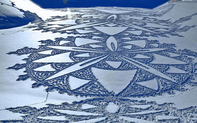
Simon Beck is a great artist with some very unique work. Drawing in the snow with various skills to map out carefully the image he wants and create that image in the snow.


He can create different designs and plans to draw out in the snow. He's done wolves to snow flakes. Though geometry is a very common theme in his work.

He often picks beautiful landscapes to draw in, so that the surrounding area frames his work, on larger, flatter plains.

I love that he creates his art in the snow, with maps skills, a compass and snow shoes. It's amazing, using his foot steps to create one off pieces of art that might only last hours. Whilst these designs can take hours of long work - which he has to follow back on his path to return for a break or his bag.

This process and his carefulness allows home to create highly complex pieces of work that can span massive amounts of space.

The details can include shading and texture, not just line detail and accuracy.
While the shadows on the snow add more detail to the work as well.


Here is a recent article of his work he has shared himself on Facebook:

http://toqueandcanoe.com/2015/03/10/simonbeckbanff/

Wednesday 1 April 2015

Drawing - My collections design development


My early drawings of my collection - which were aiming to inspire me of what I could try to achieve and were more of a artistic  expression than a set of designs for a collection. Colour meant strong textures, different materials or colours. 

These designs also work to show me use of colour and balancing materials, and allow me to see scaling and what I might need in order to produce such textiles.
For example - trimmings, elastic, sewing skills, print processes, amount of fabric etc.
 
            ______________________________________________________________________


 These drawings are more 'made-up'  they look neat and  more selective with their design. The texture used is to stylise designs I might create in my textiles, but the cut and design of the clothing allows for hints on my market.

Thick paint has been used to show possible design, materials and/or texture I might create. There's been more care in drawing the 'model' and I have been selective when choosing what materials were used.

              ____________________________________________________________________


My latest choices include more mixed-media - chalk, crayons, paint, pens and papers/textiles. More than just different acrylics, but also very selective in the colours used. Different materials are used carefully to  describe different materials, yarns and colours. As well as describing my textiles as a fashion piece, as a finished piece. These are things to consider as a part of a collection. Designs that could build the starting few pieces of a collection of  young women wear market.

The bodies I've used are used repeatedly - tracing and re-drawing my own, often editing them to stand out - black line, white highlights, skin coloured paint (yes it is very off but the closest I have) and the shapes/poses used. I changed the bum on one as I found the original was way off of being 'correct'  and twisting the bodies or moving arms allow for similar poses to be drawn quickly without them being in the way/not being shown off - which is why a change is needed. Fashion drawing for clothing designs - before and after catwalks aren't held to standards to be drawn anatomically correct. However, I find it helpful if the drawing is done suitably well, so to the estimated fit and design of a garment. 

I continue with mt mixed media pieces, especially those on tracing paper which have become a important part of designing my collection - due to the difficulty of drawing white on white or white on coloured materials. In fact influencing me to try to use this as a part of visual research using tracing paper to draw my research - textures and graffiti - and to use white pen whilst doing this. Which could build on my work and bring a stronger link from my visual research to my final work and the designs I create.

              ____________________________________________________________________


This is difficult to see but the top drawing is a girl in a vest top and skirt,
covered by a heavily trimmed kimono/loose jacket - all, but the trimming, in white.
Though there are some issues with the model's body not being  anatomically
correct I do like this drawing, and those behind.