Showing posts with label white. Show all posts

Wednesday, 15 April 2020

G . O : Living Space


Getting On : Studio wall 


 I have a small wall where I'd be hard pressed to find a cupboard to fit my odd sized tower for my PC. So, I have decorated this with a cork board and art. Everything here I've made myself or remind me of people.The cork board its self is decorated by me, as I needed something to be practical at a previous home that added some more colour to a bedroom. I wasn't allowed to paint or redecorate the space.

Cat - Mam, and visiting york.
Sign - Emily, an old housemate.
Polaroid - Dad, its of us when i was young, visiting a zoo.*
Mini print - Nana, London trip with two of my sisters.
Embroidery - I made this, with my nana in mind, but I wasn't happy with the result to give it to her.
Carriage - Old Christmases - we've lost a few of these. I think they use to be string lights and maybe used them as toys.
Ticket - Emma, a school friend. We love going to the arcades.
Postcard, lady - Step mam - she brought this for me and wrote the sweetest message.
Larger prints - London trip with two of my sisters and nana - I got to show a few areas I'd visited with friends too.


Bow, Tags, clothes peg - I've made/decorated these for practical reasons to use but wanted more colour.

*Yes I am scared to death, I couldn't put down my hand before they put away the small snake. I tried to be brave with the little one. I wasn't ready for one that was about 4/5 times longer.


                 ________________________________________________________

Thursday, 24 September 2015

Weaving scarves


Using the jacquard I designed and woven this set of scarfs. In white, pink and blue, with a sewn edge to stop fraying too much. I wanted a different design than what others were creating for our fund raising at university.
I wanted something, suited for a younger target, and lent towards a 'girlish' design. But not out right pink and in your face.  I wanted something fun and didn't think out colour palettes would work, as well as this pale pink and blue palette. I did think of yellow, of green, and I did think of purple with pink too. But I didn't like it, and I found yarns but none that worked together.

I loved how this came out when woven and washed. I am really proud of the results. The design is simple, but effective and brings together the different elements.

Saturday, 19 September 2015

Stash!


Yarn Stash!


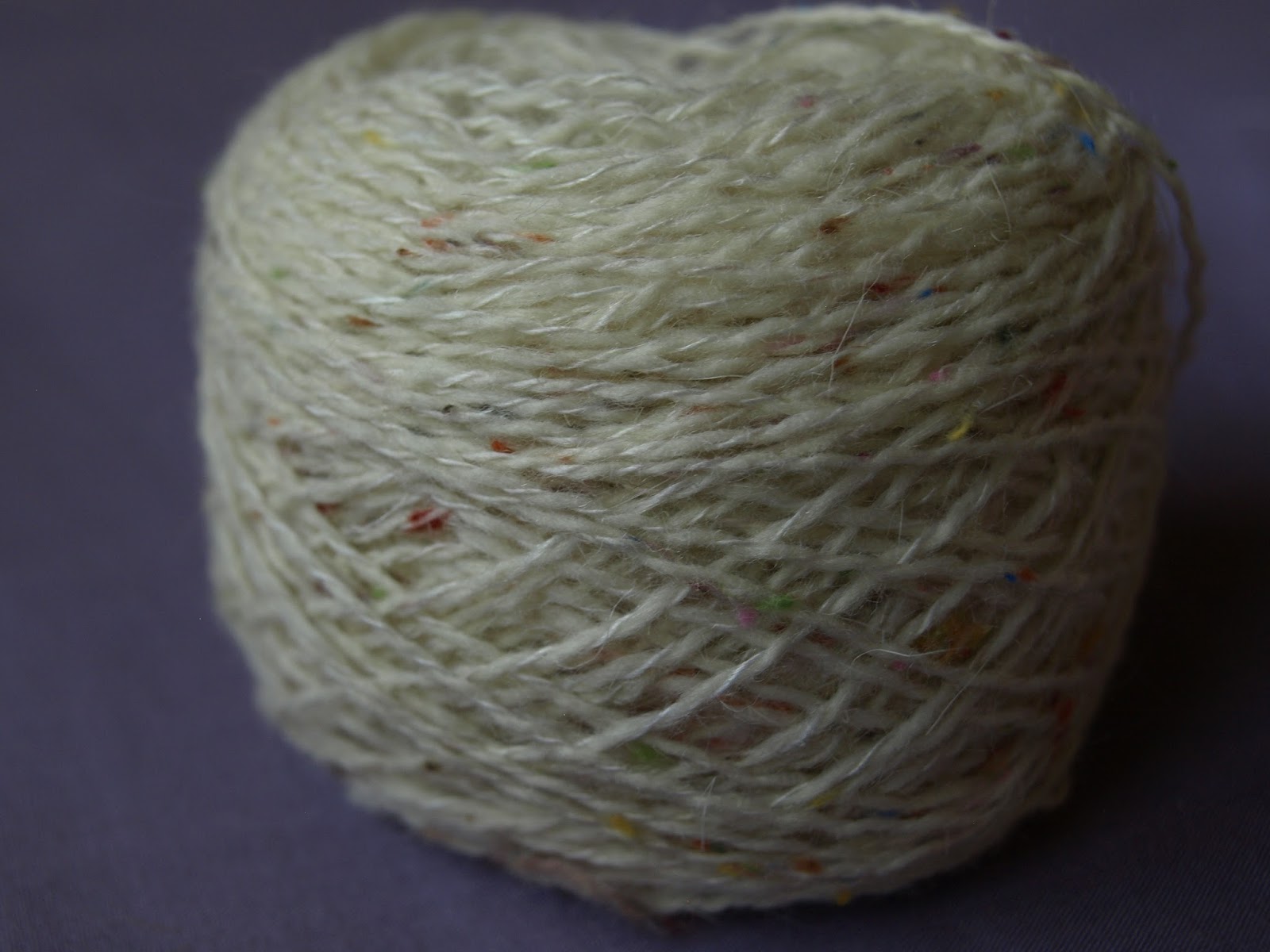
These yarns are a few that I am not using just yet (I'll share more on those projects later). I have a few small balls of cream with speckles of colour - Not enough for a jumper or anything in just this yarn. However, I could make some sleeves or use it as an edge or trimming, to a project ( I think it would be a quint little button stand if it was made from this yarn).  This is acrylic yarn, quite soft and fine.


 This yarn (below) is a silk and alpaca mix in jewel colours, I crocheted the entire length of it - bringing to coloured sections closer together.  This doesn't look right knitted tightly unfortunately. I am thinking of actually sewing or loosely knitting/crocheting this new yarn into something. My original plan was to create necklaces and bracelets with just the lengths. But, I can make something special, and I really want to with this yarn's colours.


This yarn I originally had plans for - to knit a little waist coat front with this yarn for a 4 year old, and get more yarn as I needed. As a 4 year old is likely to grow out the clothing quickly and not care much about colour matching. I thought this adorable and still do - this was last summer, and I think the little man has enough sweaters, sweater vests, etc that we all love to dress him up in. (So far he doesn't care or have a 'special outfit' he just has to wear). Now I don't know, I think its something I'd like to wear but I have no clue what to make, maybe make socks? I want it to last but its the perfect size to practice double ended knitting needles too. This is heavily dyed wool yarn.

Saturday, 4 July 2015

G.O: Photography; Degree show catalog images


 My degree work - catalog images

Photographed by a member of the teaching staff at university - these are just a few of the catalog photographs. The photographs are great, I've had some real big problems with photographing my own work due to the textures and colours. I'm really happy with how these turned out and that they photographed so well.

He took into account the textures, the layout, and even incorporated some features and themes of my work too.

My digital designed weaves - my Jacquard loom woven pieces, are kept separate from the majority of my other work. Most (especially earlier jacquard's) are focused more on the weaving of pattern pieces - thus focusing on the design primarily.

Whilst some later Jacquards do focus more on texture.Though I have tried to pick and choose weaves applied to the designs; due to their structure, colour, and textures.

The photographs seem to favor my hand made samples from the Textel looms. Which have the most variety in texture, tone, materials and colour. Giving them a larger variation between their designs and intended use.

My favorite is probably the bottom image - because the combinations of textures, some tones and colour.


I don't have much exciting news with what to expect next but thanks for reading.

Tuesday, 26 May 2015

Degree show


All done!

Four years at university and I've completed my final hand in. A whole year went into developing this project and it's taken different turns over the semesters. I've explored lace, texture and many different areas in my work.

Here is all my boards set up and ready for the degree show and marking.


 ___________________________________________________________________


_______________________________________________________________


All done!


However I plan on to keep going on with this blog and you'll be hearing more from me and my little projects for now. First, though a nice break and job searching needs to be done.


Tuesday, 5 May 2015

Warp done

Took longer that it should have - which is only my own fault. But it is now done, and ready to weave.


Now to get busy and just do that.

I have plenty of patterns ready and I really want to use that PVC for my first 
sample. I am thinking of creating 1 m long samples, which I am hoping will 
look great. First though I need to test some of these patterns I have drawn. 

I won;t be spending to long doing this but it's worth while to get  myself 
prepared and work out any mistakes and issues to sort in these patterns 
before I try weaving any samples.


          ____________________________________________________________________


2 WEEKS

Thursday, 30 April 2015

Materials


I want to plan the samples for next week to keep myself very busy. However, for this blog post I really want to look at the materials I have used in the past and what I want to consider for the next lot of work. Something to add to this is that I have two viscose yarns to make up my warp. Neither are as shiny as I wanted but they are soft and its interesting to see the differences in the twist of the yarn too.


Materials:


PVC - 71% PVC & 23% Polyester & 6% Polyurethane
 I got a lengthen of white PVC tape yarn  of 0.8 Nm. I got this locally and was surprised by their selection of technical yarns available, and the amount of colours too. 


Lurex - This is also an item I got from Uppingham Yarns, the local shop I mentioned before. In fact got two cones; one is vinyl look and the other is opaque. Both are quite fine and fairly delicate - winding a bobbin for the boat shuttle can be a lengthy process


 Chenille - I haven't used chenille before this project but I've enjoyed using it a lot, however it ran out during my last warp. I haven't decided whether I should try getting more to work into this project with. Though if I do decide to source some more I will have to be quick doing so. This does not give me more opportunity to try some other materials in my work though.


Replacement -  I've been advised to bring more contrast into my Textel work, as the new Jacquard warp will be Black and White- like the first warp.
* show work from both warps to compare.

This development with more materials should be easier with the work I've been making on the Textel and Jacquard looms which have used darker grey and black yarns. Which will be more compatible compared the the first samples I made using any grey, which were soft tones. This made some interesting work but looks too soft against the Jacquards. So, I've hoping to use a harsher grey in my work, made of wool or a thicker yarn, to press this contrast in my work.
The chenille and mixed yarns have created tones in my other samples, the grey and lurex will make a stronger contrast.


 I also want to seriously consider my samples sizes and shaping. My new warp allows me to weave 60 cm, and its been wound on the mill to be 7 m in length. I could consider creating 1 m long samples as a norm, from now, which would be great to display, but limits how much I could create. Though with the time limit it could to my advantage.


           ____________________________________________________________________


3 WEEKS

Sunday, 26 April 2015

Jacquard Warp


New Jacquard Warp, hopefully ready for Tuesday 5th May.

It will be a  black and white warp, like the one I used at the beginning of the year to create my first few Jacquard samples. This means more contrast in my work and the need to use black and white in the warp, meaning it has to be used in my designs.

This could be a good thing for my woven pattern pieces - for other samples this might not be as advantageous. Especially for samples of just weave patterns in sections as the black will need to be incorporated. Though this could produce some really good ideas and designs.
But I'm going to be happy when I can start weaving again.


This will be my last push for samples and designs.

          ____________________________________________________________________


4 WEEKS

Saturday, 25 April 2015

Blog layout - its getting an update if I can just choose!

Yep, this layout is going and on its way out -  teal and blue are gonna be changed to more suitable colours.

This layout was a good start for me blogging but it needs an update. I never even came back to really made a header image for this layout yet. Though I have tried from both this blog and the Facebook page. I haven't like anything I've developed, I'm afraid.

I need to update my profile information page and a portfolio page of my work. I might also create tabs for different projects of large work - as examples to what I have made and focused on other the years.

This will most likely be featuring uni work, rather than my little home projects, as these are small projects so far. Despite wanting to do more impressive projects at home I've had little time to really make anything large scale or detailed except for drawings and illustrations.

When I've selected the new layout I'll be comparing the two - new and old, and hoping you guys like the change.

Wednesday, 15 April 2015

3RD Warp

I have finished winding this third warp. I designed it to be composed of 3 blocks of 20cm, which can be woven with different patterns. This also allows for me to mix & match patterns, blocks, yarns, or other features.

I could have added a second warp (referred to as double cloth) or extra warp sections - but made the decision not to. This would take away from the 3 block's shafts. I would need to split the 24 shafts between the 3 blocks and another layer I added to this warp design - whether it was a second warp or extra warp.

I also choose to use two yarns     .........................................................


From these ones that I considered to use.


All of these are cotton, rayon or viscose. each have different strengths, and twists. Though the two I picked are nice viscose yarns which are very soft and have different twists - unfortunately there not what I wanted  when I was planning this warp - I wanted a set of 'shiny' yarns as I have loved using other yarns with a soft shine to them, throughout my other warp and samples - through the weft.

I have come to appreciate these yarns for the fact they are stronger and feel a little softer. They will weave very nicely.

With the completed warp - with threading done and the loom ready to weave I am hoping to have my warp plan to share on here - alongside some alternatives I considered.


Sunday, 29 March 2015

My Illustrations for my White Project

My white project has meant drawing designs could be difficult - colours won't translate to bright designs or patterns but more subtle textures. Illustrations could be down in simple black lines, but might give the idea of bold contrasting yarns, weave pattern or colour - lending a sharpness to the drawings, that could have been difficult to create in my textiles or not translate at all.


I've made use of the skin coloured acrylics, black fine liner, white pens and white paint (some mother of pearl paint too)- on both sides of the paper - allowing for fainter black line details, solid colours with fewer layers on top of the paper.
This allows for more detail to be drawn on the semi-transparent paper.

Models with no backing card and the wrong side of the clothing
 designs, drawn on tracing paper. A lot of different mediums used.

These photos are of my latest drawings, Though I do have some older designs in my sketchbook and on boards, on paper and also tracing paper.

The style has changed a lot since I began drawing my designs - which I'll share later when I have some nicer images of the work. I had actually started with white chalk and black charcoal on tracing paper. I was surprised that the hairspray didn't affect the tracing paper very much, compared to wet paint or watered down paint.


This is the right side of the drawings. 


Tuesday, 24 March 2015

My project of no name

My project for my final semester - is a project I have been doing for my final year, as I have continued my project over from my first semester. The research started over the summer in 2014 and  based on graffiti and the surrounding area (architecture and the 'canvas' used), only. I still have not named this project or the collection I am developing from it.

Geometric design has been something that's helped to build my designs, but I've tried to keep it bulky or sketchy in style to not have a fine artistic style to my work. Setting my work away from designs that only feature geometry in their work. So there is no minimalist style to the designs that make them look clean and neat. Something texture and graffiti paint isn't.

White became my palette choice after summer, to little the variety in my work and the help focus solely on the texture to develop my work. It became a feature instead. And in my final semester I have chosen to stick with it- only applying some amounts of grey or black due to the influence of materials and my theme of snow. Allowing for some experimenting with other materials not available in brilliant shades of white. 

The main issue I've faced is in sourcing white materials - due to the fact that I am avoiding most optic whites and cream shades so my work does not appear to look 'dirty' or mismatched. I have seen some of my work in natural light outside the studio and the differences can be seen very well because I am using white. Online sourcing is kind of scary and the studio is not stocked with many choices for those who are nit-picking. Though this has led to more experimentation on my part, and built on my development for colour matching and palette selection.

In a later post I'll cover my research points, issues and sketchbook to allow a more detailed view of the projects development. Also I will cover where this project is going. However my aim is to use this work to develop fashion wear for young women, 16+, for a mid-high end target audience. So higher than high-street fashion. This lets me create fabrics and see how they can be used for garments in my own collection. So design can be affected by use, rather than creating a collection selecting suitable fabric/s.

Saturday, 2 March 2013

Trend report 2, 2013


We've got white, floral and the geometrics are still in style - with the checks and stripes, as big as chunky as possible.
We've got the shine without sequins and a lot of chioce in Bomber jackets soon.
Finally people areen't saying black is the colour for Spring, I know people will wear it but its not a colour theme for Spring, its an easy choice.


All from Company and marie and other magazines from January and February I will name course of, as they aren't my images.